
An e-commerce website for sustainable and ethical fashion (student project)
Objective

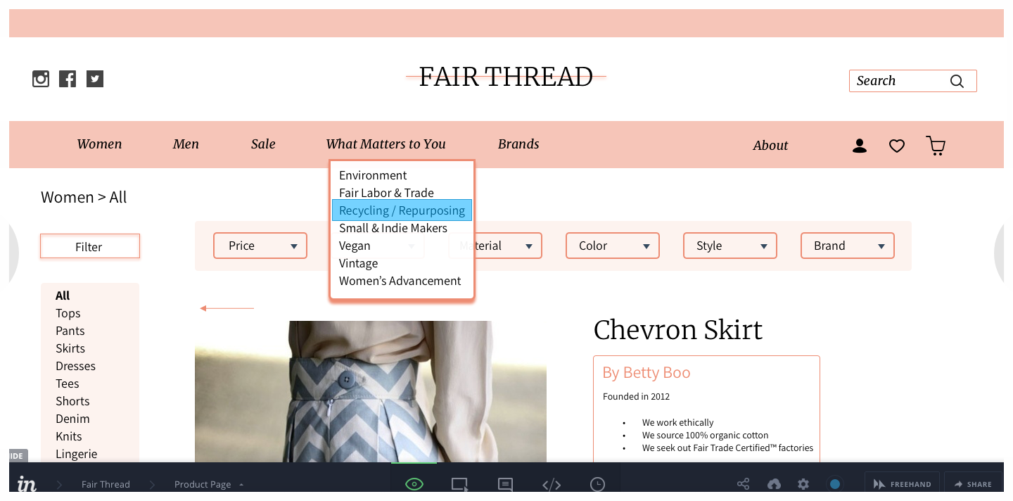
Drop down menu from navigation including types of fabric important to ethical consumers
Streamline the shopping experience for sustainable fashion consumers - and attract would-be consumers - by centralizing existing sustainable brands into one online store. Brands are vetted and curated based on sourcing and production. The website itself follows ethical and sustainable guidelines.
PROPOSAL
Research
Learn online shopping habits of sustainable fashion consumers and the pain points they encounter. Find out hurdles faced by would-be sustainable fashion consumers.
RESEARCH PLAN
Methods
Survey: I created a survey and sent it to 80 people to find sustainable fashion shoppers and learn about their habits.
FULL SURVEY
One on one interviews: From the responses I picked 4 people to interview one on one in person.


Competitive analysis: It is hard to find websites that centralize the sustainable fashion shopping experience, so I chose 3 e-commerce websites that sell multiple clothing brands to gauge their usability heuristics (per Nielsen Newman) and use as competitive analysis.
Saks has an efficient and clear design with breadcrumbs that allow the user to always know where they are. Filter options can easily be changed. The website is chic and clean but could be considered intimidating and cold.
Zappos has very efficient filters and breadcrumbs with dropdown menus throughout the site and a readily available search box. What it gains in efficiency, it lacks in visual consistency with multiple font styles and colors that make the site look like a bargain bin.
Gilt is inconsistent in its efficiency, it requires the user to remember their choices. The visual design is clear with bolding of important information and what would usually be considered the “small print,” which is important for an outlet type website.
Card sorting: I picked 3 users from the one one interview participants. Each user was given blank cards to write what matters to them in an online shopping experience. Then these cards were shuffled with cards we created. The user had to sort the cards under “important”, “interesting”, and “not interesting”. Then the user had to narrow down a top 5 in the “important” cards, and finally a top 3. This helped me figure out the Top 3 items that matter to my users.
All photos
Spreadsheet with all results
Even though I got 3 different Top 3, some themes were recurrent. Sale/price of items, fit, photo quality, information about the item (material, maker). My sustainable users want to know that they are getting their money’s worth and if possible a good deal. They also want to make sure they know details on the items and that the product images represent it accurately.
Results

This research yielded interesting results and insight into the minds of sustainable fashion consumers. Here are the important points to keep in mind:
They want as much information on the products as possible. They are interested in the backstories and how the companies produce the items.
They understand sustainable products are more expensive but also would like to able to have access to affordable options. They want to make sure their money is well-spent.
They don’t regularly shop online and prefer to go to brick and mortar stores. They are worried about fit and sizing and if the pictures showcase the items accurately.
When shopping online, the experience can be frustrating with many different sites to visit and several tabs opened to find an item. Also multiple checkouts since they will have to do one per store. Finally, returning items is a hassle.
For those who are would-be sustainable consumers, they don’t know where to start and it can feel a bit daunting.
COMPLETE FINAL REPORT
Empathy maps: I created Empathy Maps for each of the one on one interviews participants from the results. I used these empathy maps as a way to gather and analyse my notes from the interviews. It helped with the creation of the User Personas.
ALL EMPATHY MAPS
User personas: I created 3 user personas from the 4 empathy maps. These User Personas allowed me to focus on what was important to my sustainable shoppers, and to create scenarios and features for the final product. A detailed persona lends itself to a detailed scenario which then will help create a relevant design. Moreover one persona can lend itself to multiple scenarios.

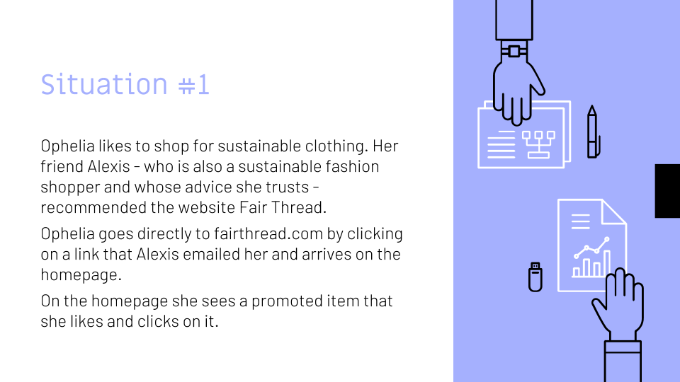
Scenarios: I used the persona of Ophelia to create a scenario. I chose this persona as my Primary Persona and used her goals and attitude to create a shopping experience scenario from beginning to checkout. The importance of scenarios cannot be underestimated as they allow us to put in context what our persona will experience and the pain points to solve.
OPHELIA’S SCENARIO


Design
User flow
These user flows were designed to accommodate different scenarios (or situations). Again, a persona can go through more than one scenario and it is important to think about how the user comes to the website and what their point of entry might be. The homepage is important but the reality is that it is not always the starting point of the experience.
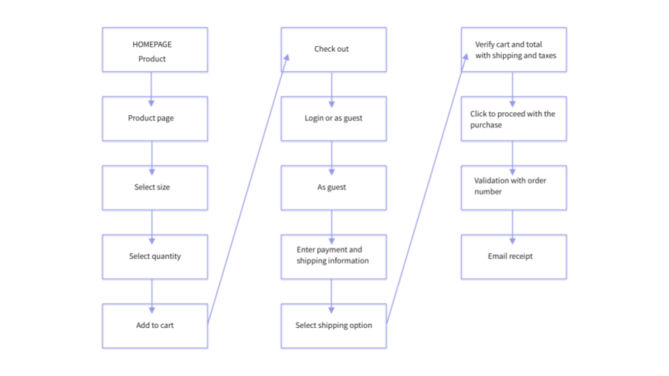
Each situation allows us to figure out what pages and functionalities the user needs to achieve their goal. Through these scenarios I was able to start a thorough catalog of all that will be needed for the website to function even as a minimum viable product.
All user flows
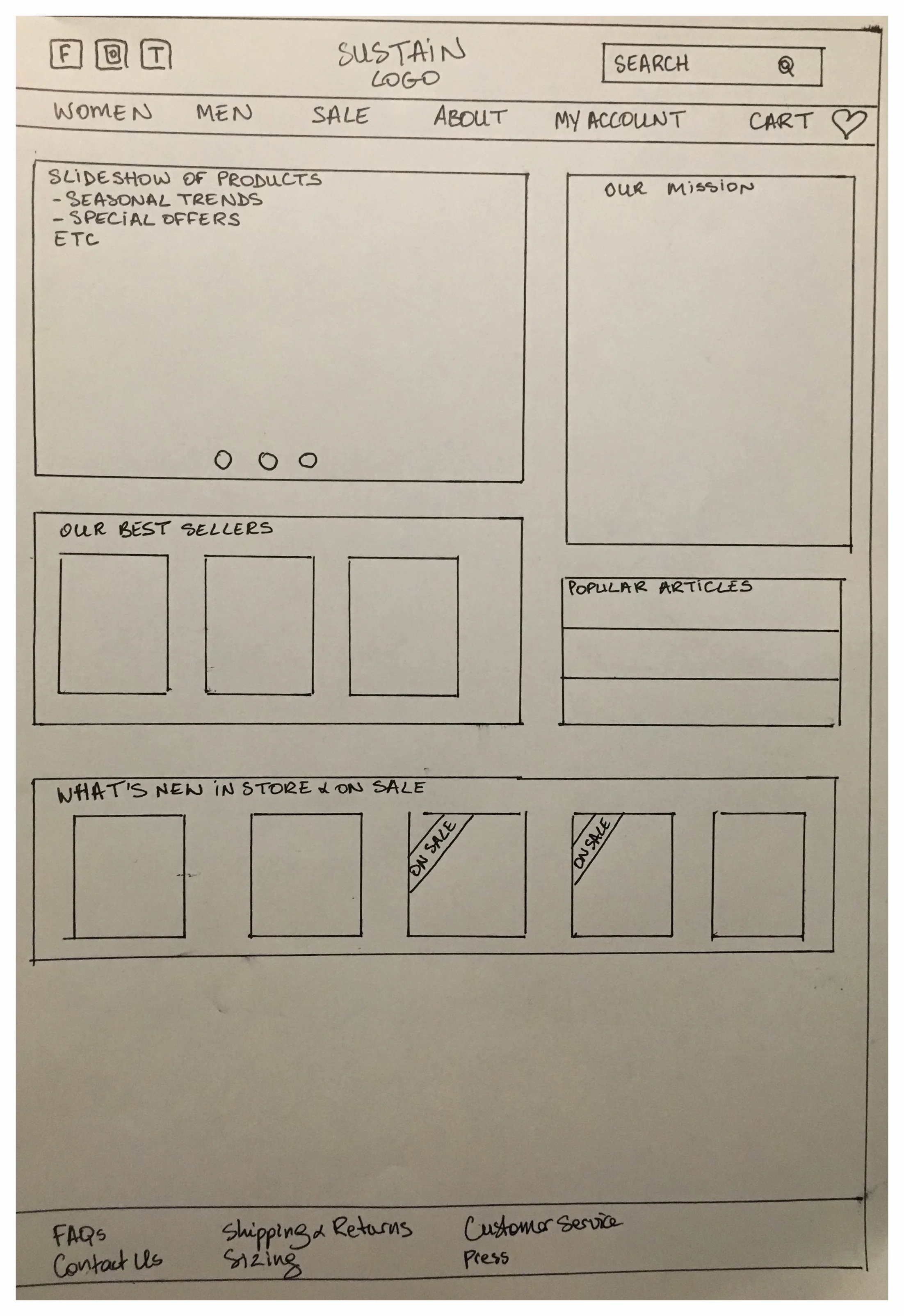
Wireframes
Starting with hand-drawn sketches and moving on to softwares such as UX Pin and Sketch, the design progressed with changes along the way due to trial and errors as well as quick feedback from users. The wireframes in Sketch can be considered to be the third iteration. Also, the name of the website changed from Sustain to Fair Thread due to feedback that Sustain was too broad and didn’t refer directly to clothing.
One substantial improvement through iterations was to make sure to have the concerns of the sustainable client addressed directly rather than hidden behind submenus and pop-up windows. The “brand pop-up” on the product page became a callout in a box, and the “What Matters to You” section was added to the top nav bar rather than being part of the drop down under a gender of clothing.


Style guide
Color palette: The goal was to avoid colors like green and blue that would be a bit too on the nose for a website about sustainability and eco-friendliness. Falling into millennial pink was also avoided with a peach color used with various degrees of opacity. The clothing had to be the focus and keeping one color for the palette was intentional. It shouldn’t clash with the garment designs. A clean white background was also important to give a minimalist look, almost zen-like, and most of all to look organized and clean. The goal was to look chic but not intimidating, reflect the quality of the garments, and offer a pleasing and soothing experience.
Typography: The typography also had to look chic and clean, a mix serif and sans serif that would complement each other. Merriweather and Assistant are a pleasing combination reflecting style and function because they are easy to read yet not completely basic.

Style Tile (click to enlarge)
Prototype
I used Invision to create a clickable prototype from my Sketch mockups. With this prototype I was able to start user testing sessions with sustainable shoppers and see what worked and what could be improved.
Testing
Testing sessions were done with 4 different participants. Each participant was asked to go through their latest online shopping experience to see how they went about it and what issues they encountered, if any. Then they were asked to try the Invision prototype of Fair Thread and give feedback.
Testing was overall successful. Participants were able to do the same process they were doing on a site they had shopped at before and they were able to accomplish the required tasks. They also gave valuable feedback on their specific needs as sustainable consumers and raised a few concerns. They appreciated the functions already in place and found the experience overall pleasurable and interesting.
testing results
After considering the feedback from the testers, I made a list of actionable items that made sense, considering also earlier research data and how these would impact positively the experience of our personas.
Add sorting options for Newness, Best Sellers, Men, Women
Add details to the reviews section (height, weight, size)
Add a heart icon (for saving items) on images of listed products
Add a different view image that changes on hover for images of listed products
Move the What Matters to You section to the first place in the top nav bar
Move Vintage out of Styles in the dropdown and make it its own line/category
Conclusion
This project was very interesting to me for many reasons. First of all it allowed to delve into a world I was not entirely familiar with - sustainable fashion. It was brought to me as a problem to solve by a coworker and I had to research this field extensively, specifically from an e-commerce standpoint. I had to gather user data and really get to know the sustainable fashion consumer. Then, figuring out how to make the best e-commerce experience for this user was a compelling challenge. E-commerce is part of most people’s lives and has set codes familiar to most. The goal was not only to apply these codes that shoppers already know and expect, but also to adapt and even transform some aspects for the needs of the sustainable shopper. There would be of course much more work to be done if this were a professional project, but as a student project it allowed me to understand the steps and challenges of a UX design project from research to prototype and testing, and to recognize how essential empathy is in this process.